

How will Google’s new mobile friendly Algorithm impact your business?

Google updates their top-secret algorithms on a regular basis, but their newest update which started on April 21st has many business owners worried and warning of a possible “Mobilegeddon.” Google’s new algorithm formula favors sites that it defines as a “mobile friendly website.” This means that sites that don’t fit the description will be demoted in Google’s search results on smartphones. According to Google, they want consumers to “find content that’s not only relevant and timely, but also easy to read and interact with on smaller mobile screens”
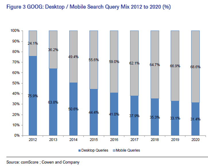
Mobile Searches have rapidly increased over the past few years, so favoring a mobile friendly website on searches made on smart phones seems like the next logical step in our day and age. But a study done by online Internet marketing firm Portent found that a majority of the web’s top sites actually are not mobile friendly. Some bigger websites may not be mobile ready because those organizations may have a mobile app, and don’t think they have to worry about the web. Others might not think mobile users are a big enough proportion of their overall web traffic and in some cases it’s just a lack of organizational inertia.
How will Google test for a mobile friendly website?
The algorithm will scan each page on the site, checking for load times, responsive design elements, and mobile best practice. For now, searches on tablets won’t be affected, but this is likely to be in the pipeline – so it’s worth getting ahead of this change.
The main things to bear in mind are: using text sizes that are readable without zooming, content that fits the screen so scrolling and zooming aren’t necessary, and spacing links so tapping the right one isn’t tough for users. Websites made with Adobe Flash are a big problem for mobile friendly website rankings too, since it is not commonly supported on mobile devices.
If you’re not mobile friendly, what can you do?
The impact this update will have on your business depends on how much of your web traffic comes from mobile devices. Some websites could rank on the No.1 spot in organic desktop searches based on Google’s myriad other ranking factors, even though they fail the mobile friendly test. The aim of the search engine giant is to give the best search result for the user, and in some cases the mobile friendliness of the website doesn’t matter when it comes to the uniqueness of the content.
In order to avoid a setback in online revenue streams, business owners can take the following preventative and/or corrective measures to assure their sites do not leave their current place of prominence during Google mobile searches:
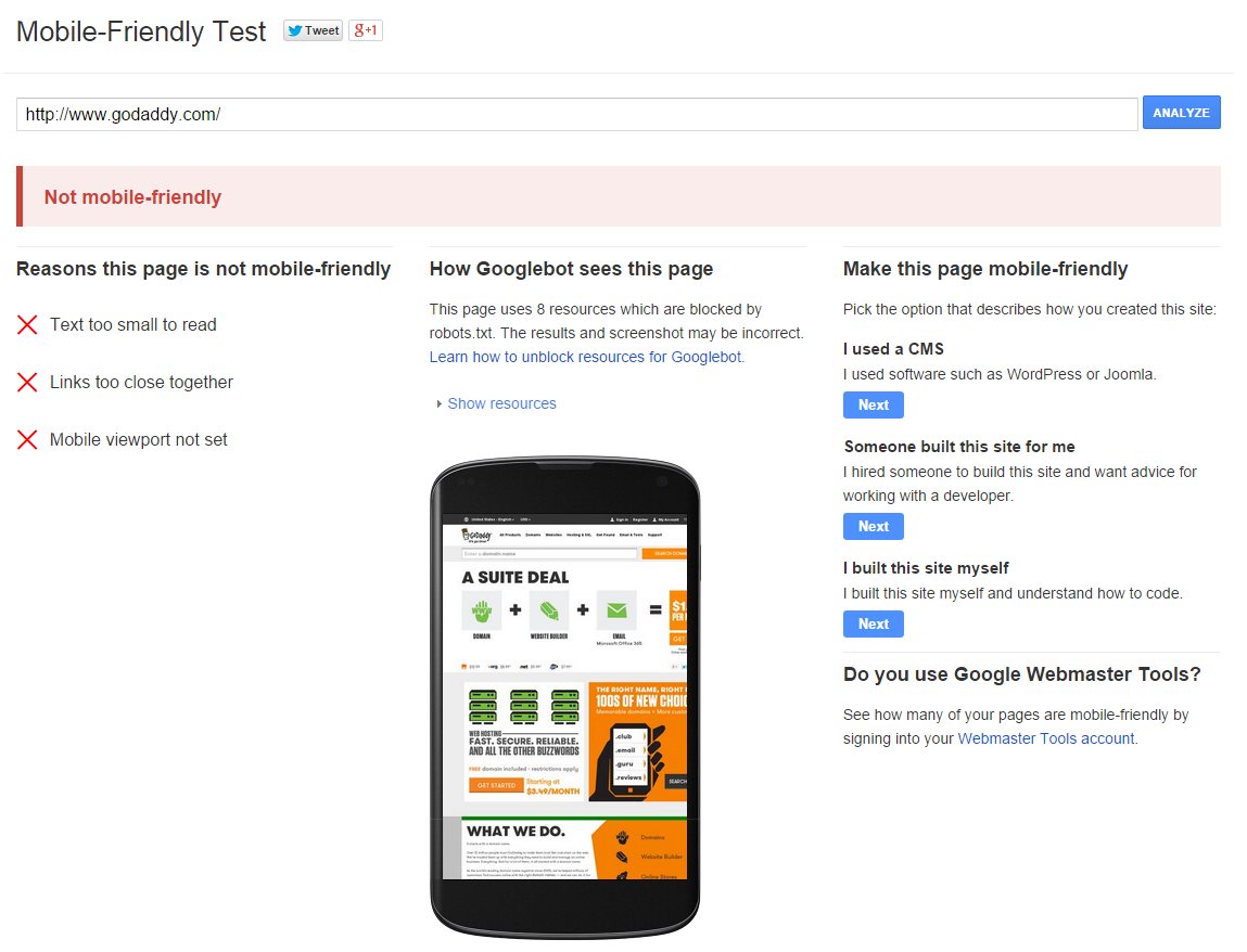
- To check your website’s mobile readiness, use Google’s Mobile-Friendly Test. This test will give you a list of potential problems with your site that may prevent your site from showing up in mobile search results after the update. Webmasters can also use their Webmaster Tools account to get a full list of mobile usability issues.
- Avoid software that is not common on mobile devices, like Flash – if your website relies heavily on such technologies consider modern web alternatives. The involvement of your web design agency is probably necessary.
- Use text that can be read without the need to zoom in – you are likely bound by style guides but set your font sizes to scale properly within the viewing area (view port).
- Place links far enough apart so that users can easily tap the one they want – correctly size and space buttons and navigational links that suit the mobile audience. This can be achieved without large-scale changes to website design.
- Prevent your site from blocking search engine access to your CSS and image resources via robots.txt – robots.txt files are placed at the root of your site to indicate those parts you don’t want accessed by search engine crawlers. These are easy to remove to make the site easier to ‘read’.
- Call your local website host. Many have tools in place to transition your website and consider moving to a responsive web design.
Finally, if you’re a small business and can’t get this done any time soon, there is no need to panic. Most local businesses’ websites are found through directory services like Yelp and Google’s local search listings. For instance, you typically go to Google and look up “car repair” and the local listings show up first. Just make sure all your local information is current and up-to-date especially on Google’s MyBusiness section.
It’s to the benefit of all businesses to be quick to get up to speed with mobile and make sure their sites deliver a positive user experience. Consumers have a propensity to abandon your brand if they are struggling to look at your products, make purchases or contact you when on your site. If you consider the rate at which mobile search is exploding – especially in emerging markets that are mobile first – the mobile e-commerce opportunity being offered to businesses is huge and it’s worth making the changes needed to stay current and make your customers happy.
If you’re ready to go mobile, get in touch. Every GetOnline NOLA sites is a mobile ready website. Responsive design is included for free.


